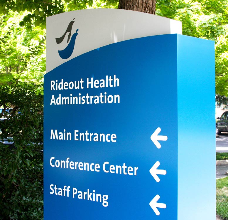
Healthcar e facilities are complex. They are extensive webs of interconnecting and nearly identical rooms, monochromatic hallways, and multiple buildings. Navigating these massive mazes can be disorienting and frustrating on top of what may already be a disquieting experience for health reasons. In fact, getting lost is among the top complaints for visitors to healthcare facilities.
The latest research shows that “text and arrow” signage is no longer adequate to most effectively guide our experiences through a healthcare environment. The inherent complexity of navigating healthcare systems requires a more robust, multi-faceted, and thoughtful approach to guiding patients and visitors to their destinations.
In inefficie
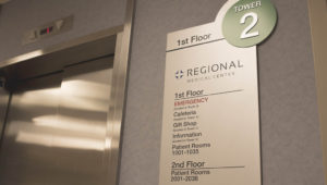
As said, Healthcare Facilities are complex, and methods of directing and informing patients on their journey are equally complex. To do it right, years of tried experience, care, and an eye for identifying the unique needs of the Facility are needed. Correct implementation of signage and information can truly transform patients’ experiences, empower their perception of the Facility, and lends to a holistically more pleasant atmosphere for the staff.
Our strategy to wayfinding and empowering staff, patients, and visitors, is as follows:
- Simplicity – Most visitors can only retain two pieces of information at a time.
- Identifying – Defining borders of a campus, identifying entrances (primary vs. secondary).
- Traffic – Studying the realistic traffic flow.
- Imagery – The use of color, symbols and graphics. Determining if another language is needed.
- Consistentcy – Consistent use of terminology and messaging throughout the campus and facility.
- Direction – Directing to departments and then directing them back out of the facility.
- Comprehension – Understanding healing environments and what type of audience we are navigating.
I. Planning
- We have an initial owner/designer/fabricator team meeting to establish the scope, objectives, direction, and makeup of the family of signs.
- Next we discuss the time-frames, project milestones, scheduling goals, and coordination obstacles.
- This is followed up by laying out the review processes for the project schedule and approval.
II. Design Development
- With scope and objectives in hand, we collaborate with the ownership team to further clarify Programming details.
- We verify footings and supports for signage that will drive the engineering specifications of the signs.
- Local sign codes are outlined to determine restrictions.
- Design Concepts are reviewed to ensure that concepts are congruent with the vision of the ownership team and identity of the healthcare facility.
- The facility is walked through in full to justify the the location of each proposed sign
III. Shop Drawing
- Concept Designs are compiled into fully specified construction drawings.
- The following is provided to the ownership team in hard copy as well as electronic format (PDF):
- Elevations and dimensional layouts for each sign type
- Section details
- Colors and materials specifications
- Mounting and installing requirements
- Sign location plans
- Sign face layouts
- Fabrication shop drawings to be provided by Image Group as part of the manufacturing process. These shop drawings are for the review and approval prior to production of signs.
IV. Implementation
- Before Fabrication, shop drawings and full size patterns are reviewed for compliance
- Samples of materials, colors, and finishes for workmanship and compliance are corroborated
- We hold a pre-installation conference and walk through with ownership and installation team to resolve any installation conflicts
- Finally we prepare contractors final punch list


